Role: Product Designer
Year: 2019 - 2020
Deliverables: Product Design, Visual Design, UX/UI Direction, Animation
Navigating Life together
Overview:
I closely worked with Product Designers and developers to ensure MetLife’s current .com site would undergo a new design experience due to MetLife’s rebranding. My role was to create UX/UI experiences and animations across this new site redesign while creating new components based off of the new rebrand.
The Challenge
Redefine the current MetLife.com site and identify areas of opportunity to create scalable components and dynamic animations.
Business Goals:
Create a homepage, product level page and search functionality.
Brand Goals:
Blend and fuse new MetLife branding into new components.
Product Design Goals:
Elevate old components and enrich the experience through a new product design system.
Current State
At the beginning of the process, we observed and examined the existing user experience to identify key areas for improvement.
Old Site is off brand and the overall experience does not keep users on our site for too long.
Competitive Analysis
A competitive analysis of our user engagement was conducted between MetLife and three main direct competitors. The study found that users were bouncing out of MetLife’s site without engaging with content.
Priority Segments
By category, we listed out what unique users need when visiting MetLife.com. After compiling user needs and competitive data, we found there was one main pain point for a successful redesign. To support the different needs of MetLife.com users, we rose up to meet them where they needed help to navigate their needs. In order to do this effectively, personalization was essential.
MVP Personalization
Before designing a personalized approach, we identified visitors to Metlife.com by using localization methods and behavioral actions.
New Site Map
While auditing the current navigation and footer we were able to detect “dead Links” and areas in which the user could get lost. Below is the new Site Map for that experience.
Metlife Rebranding
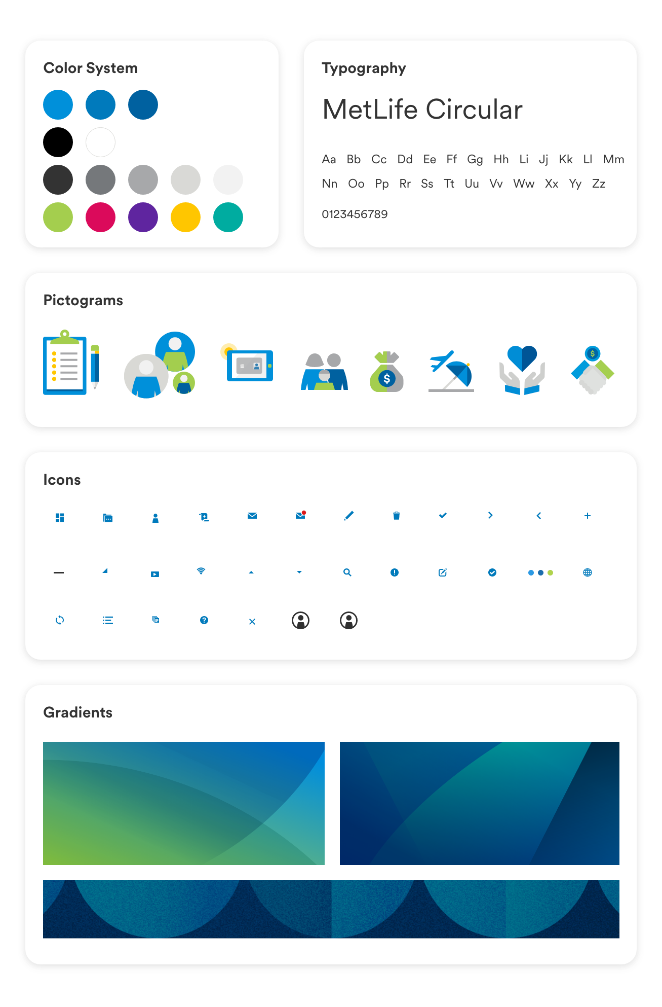
Working closely with the brand team, we were able to merge new iconography systems to gradient palettes to elevate new components. Below are some elements that were used for approaching the new site.
Design System 2.0
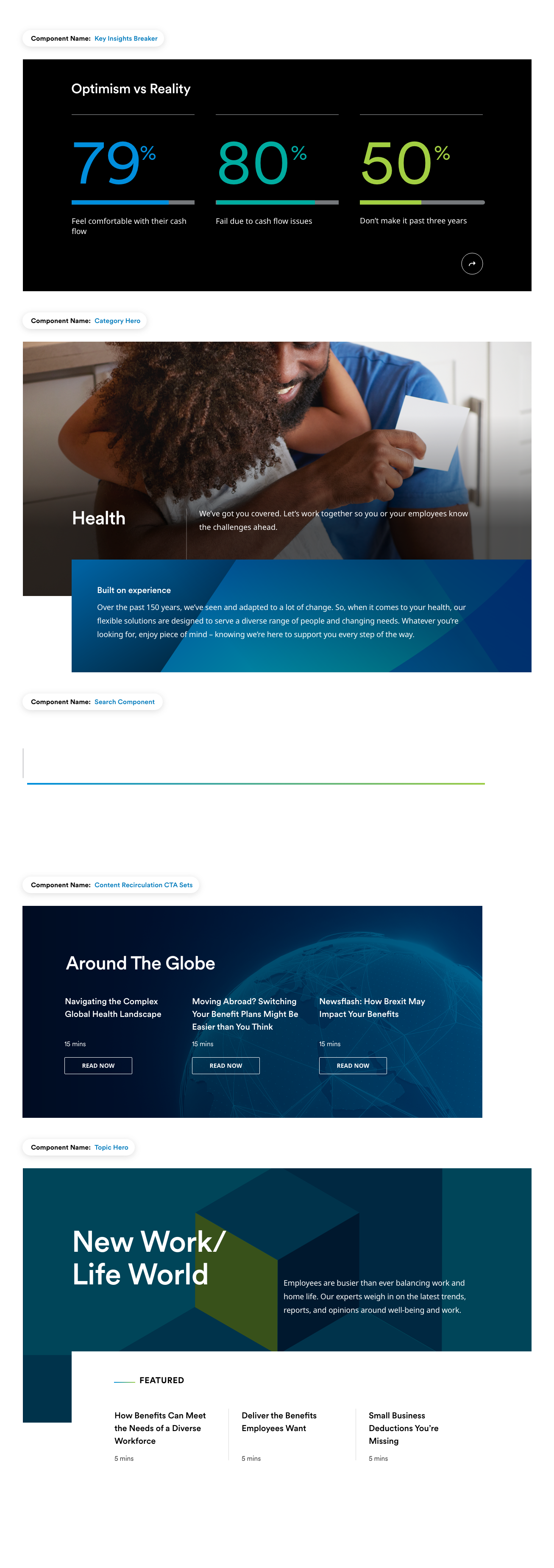
The new design system included comprehensive marketing components to interactions. We built components that were easily scalable to our international markets for present and future applications. Below are some (not all) standalone components that I created for our new MetLife design system.
UI Animation
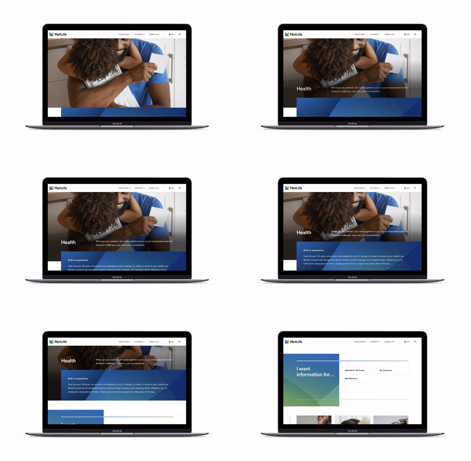
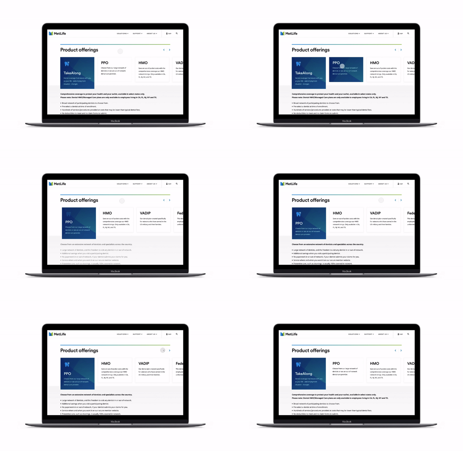
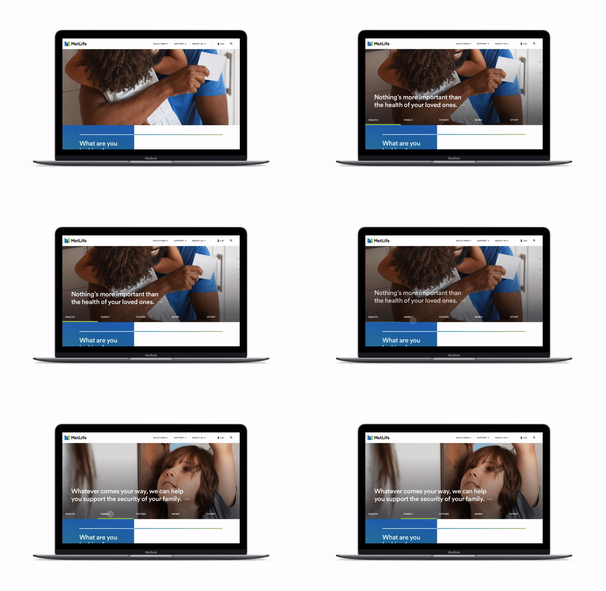
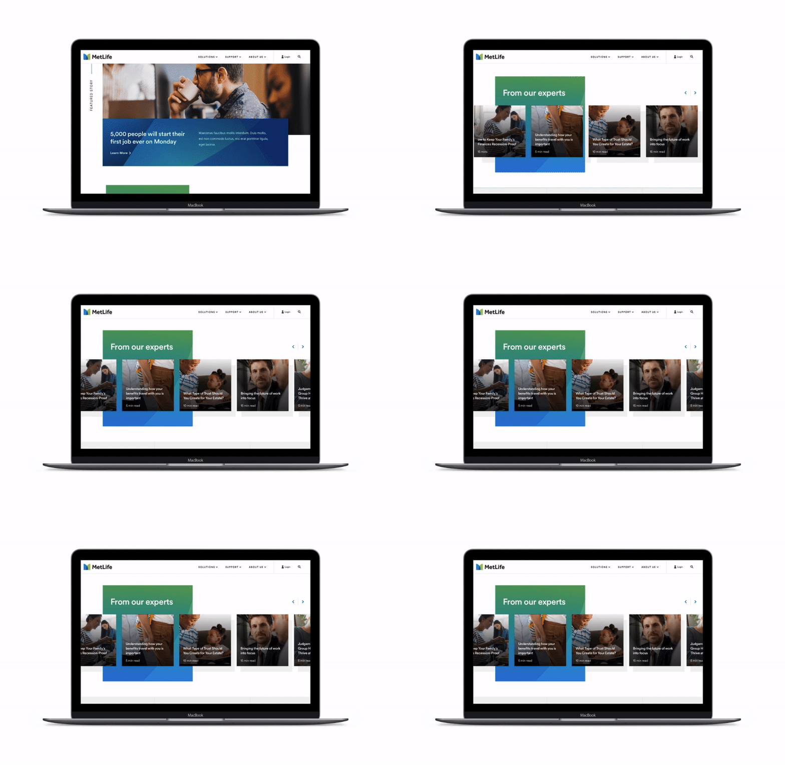
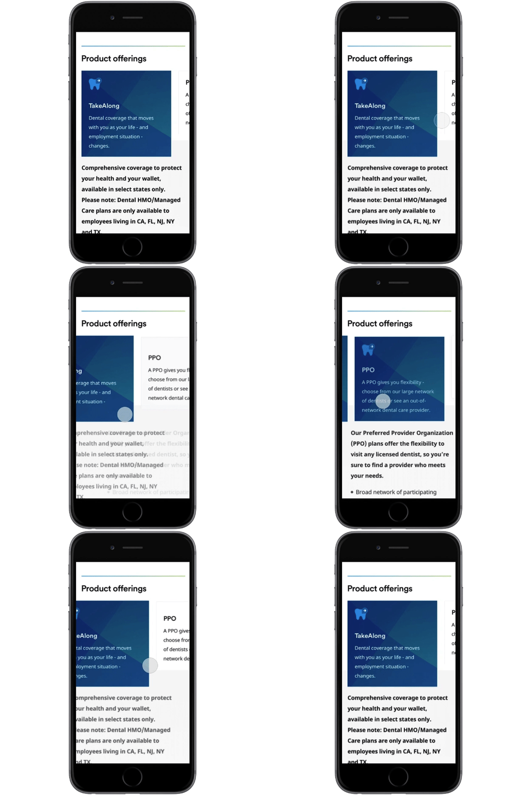
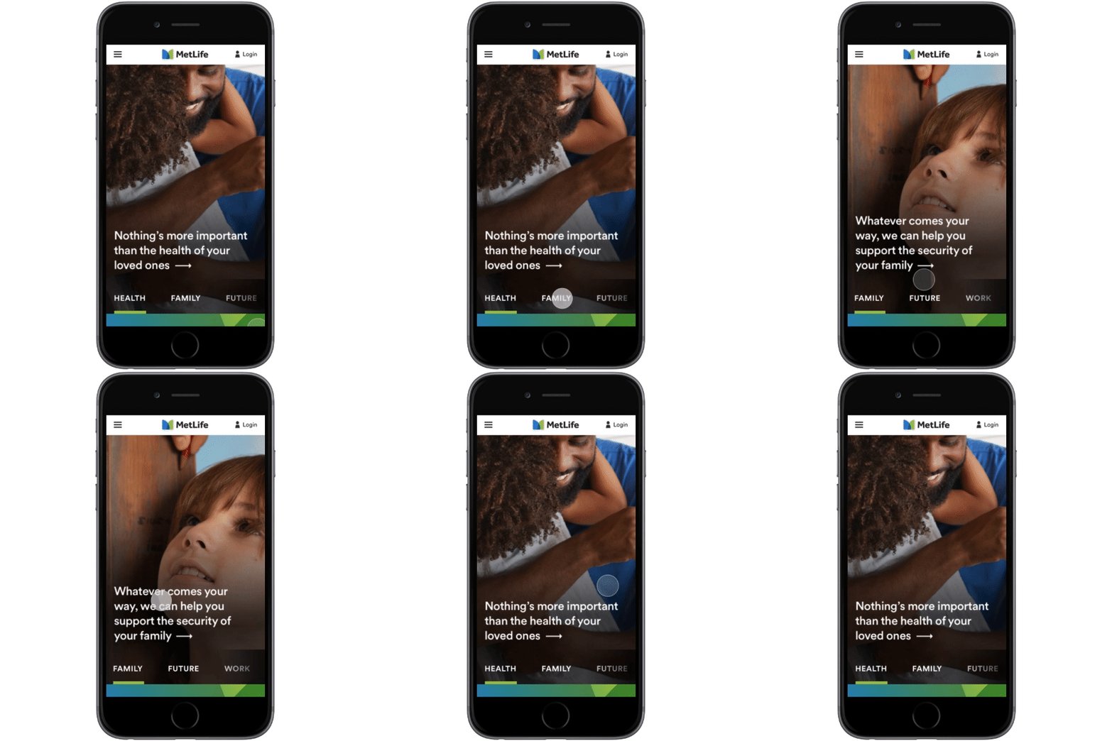
Animations were created to show developers how components should behave upon user interaction. I created these animations with Principle and After Effects. The following are a few components in action.
Category Hero: Loading build up and scroll
Product Offerings: Card selection and carousel
Immersive Brand Nav: Hover/selected state
Content Carousel Recirculation: Loading in
Category Hero: Clickable Expand/Collapse
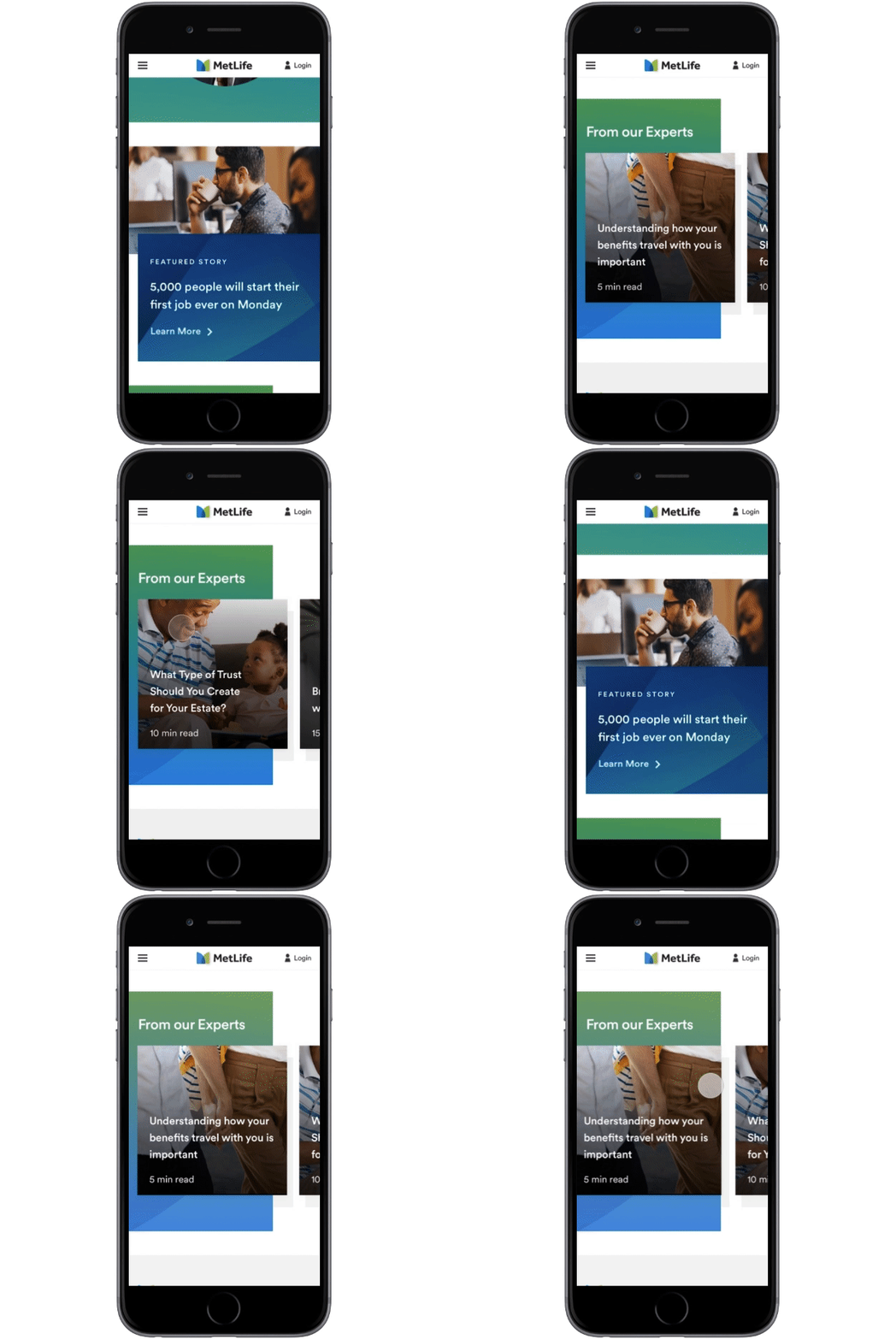
Product Offerings: Card swiping from side-to-side
Immersive Brand Nav: Swiping from side-to-side
Content Carousel Recirculation: Loading in and Swiping side-to-side


