Role: Product Designer
Year: 2019 - 2020
Deliverables: Product Design, Visual Design, UX/UI Direction
A new Sales Agent APP Experience
Overview:
The Global Design team was tasked to create an immersive Agent Portal App that consisted of transactional experiences for both the agent and their prospective client whom they are selling MetLife insurance too. We delivered this App experience within a tight deadline of 3 months while still providing an enhanced user experience and meeting International business goals.
01. The Challenge
Overall:
Redefine the mobile app sales experience for Relationship Managers (RM) in the field when meeting with prospective and existing customers. Also, identify areas of opportunity to help facilitate the sales experience for both Agents and Customers.
Business Goals:
Produce a high-fidelity prototype within a 3 month time frame.
Brand Goals:
Blend and fuse new MetLife branding into new components
Product Design Goals:
Elevate current old components and enrich the experience through a new product design system.
Old Site is off brand and the overall experience contains scenarios/tasks that users can’t accomplish
Our Process
The Agile Method is how we implemented our design thinking approach but we worked in a linear progression format to meet business goals as well. I worked and collaborated with GBM (UX, Content, Brand & Design) and GTO Agile Pod teams in the development of this application. In the context of the UX Team, we incorporated lean UX principles/practices into our Agile process. We were also able to get feedback and go through multiple iterations that we thoroughly validated.
02. Research Phase
Traveling to Saudia Arabia
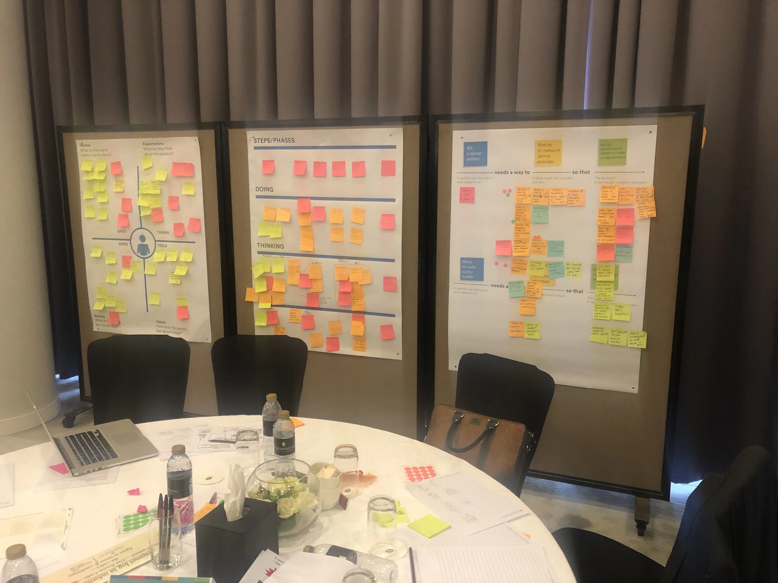
An immersive design thinking workshop took place in Dubai to understand RM pain points while also creating user stories, and multiple empathy maps with numerous groups of RMs.
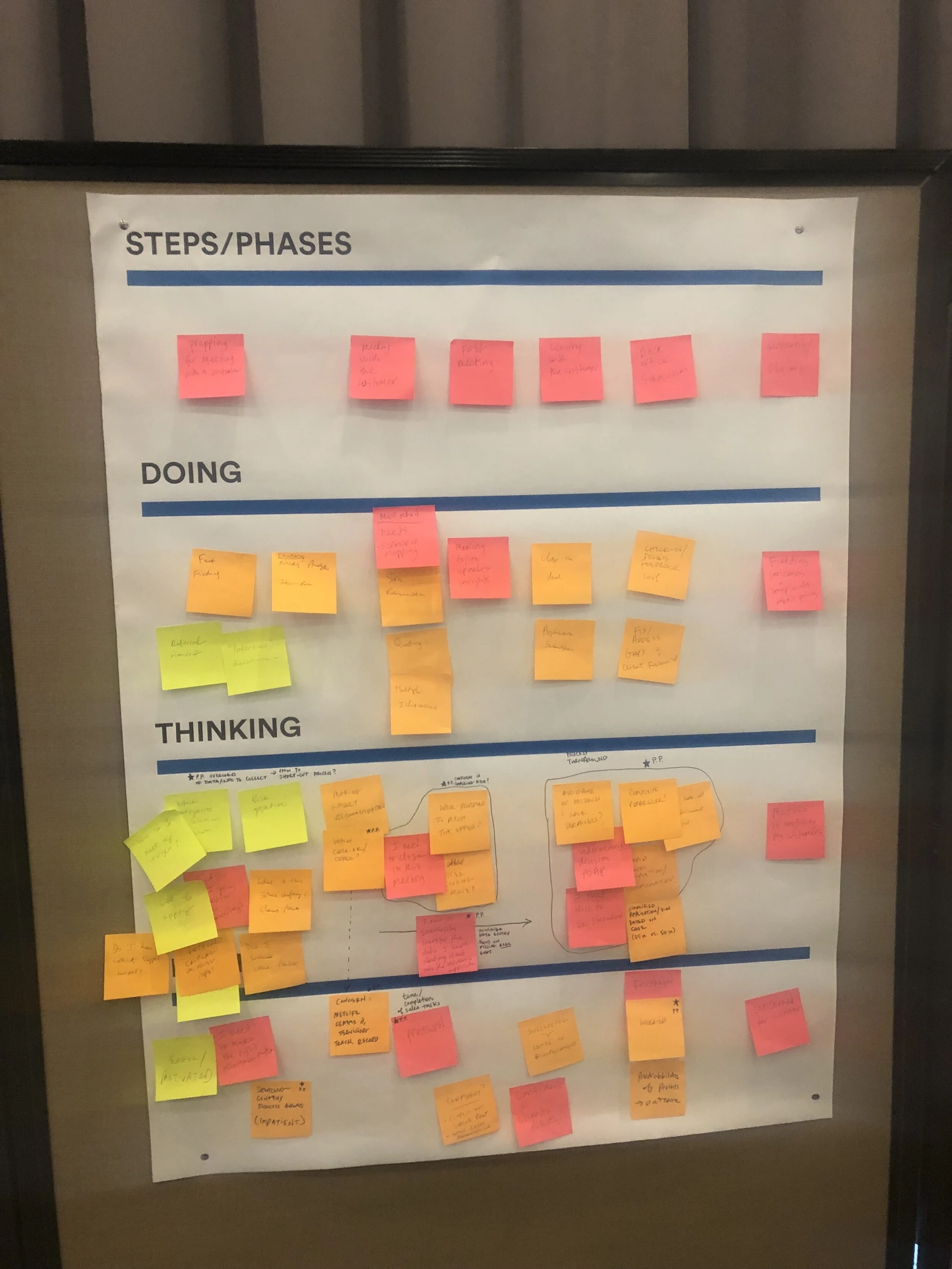
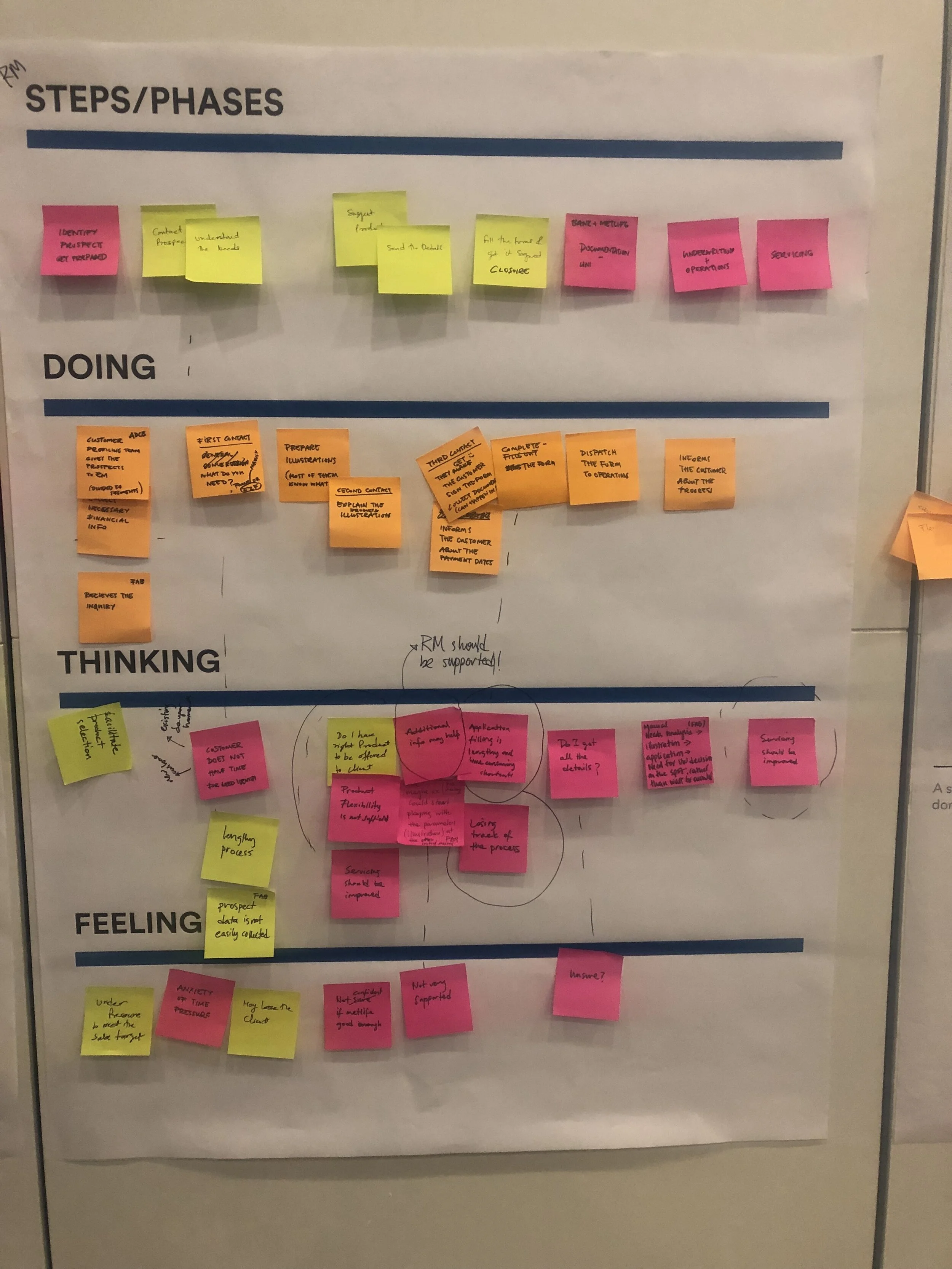
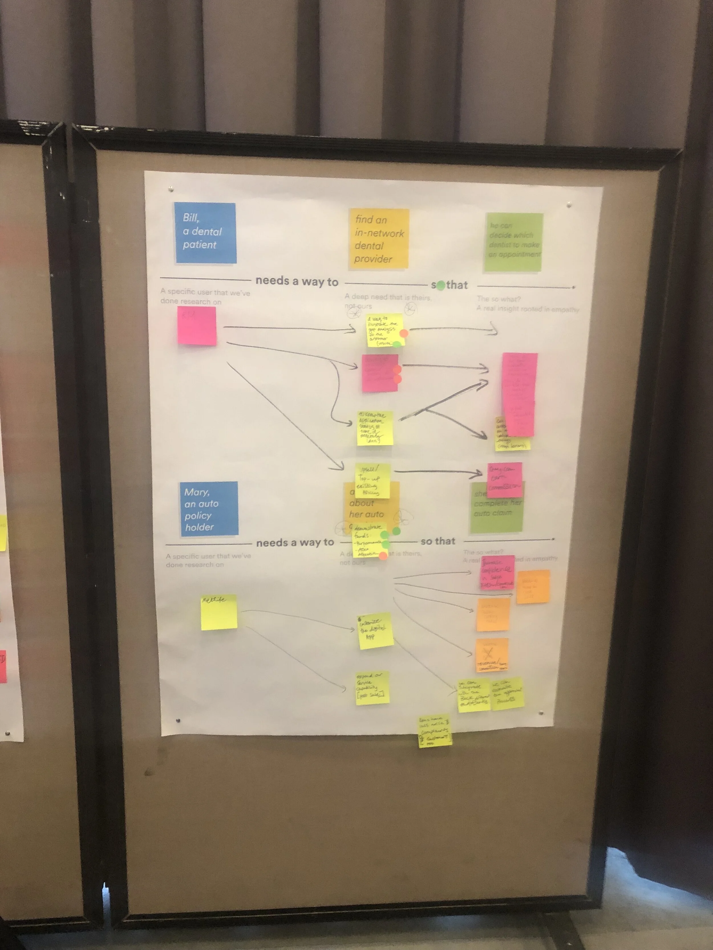
Below are 4 key immersive activities conducted during the research consisting of empathy mapping, as-Is mapping, user story building and user interviews.
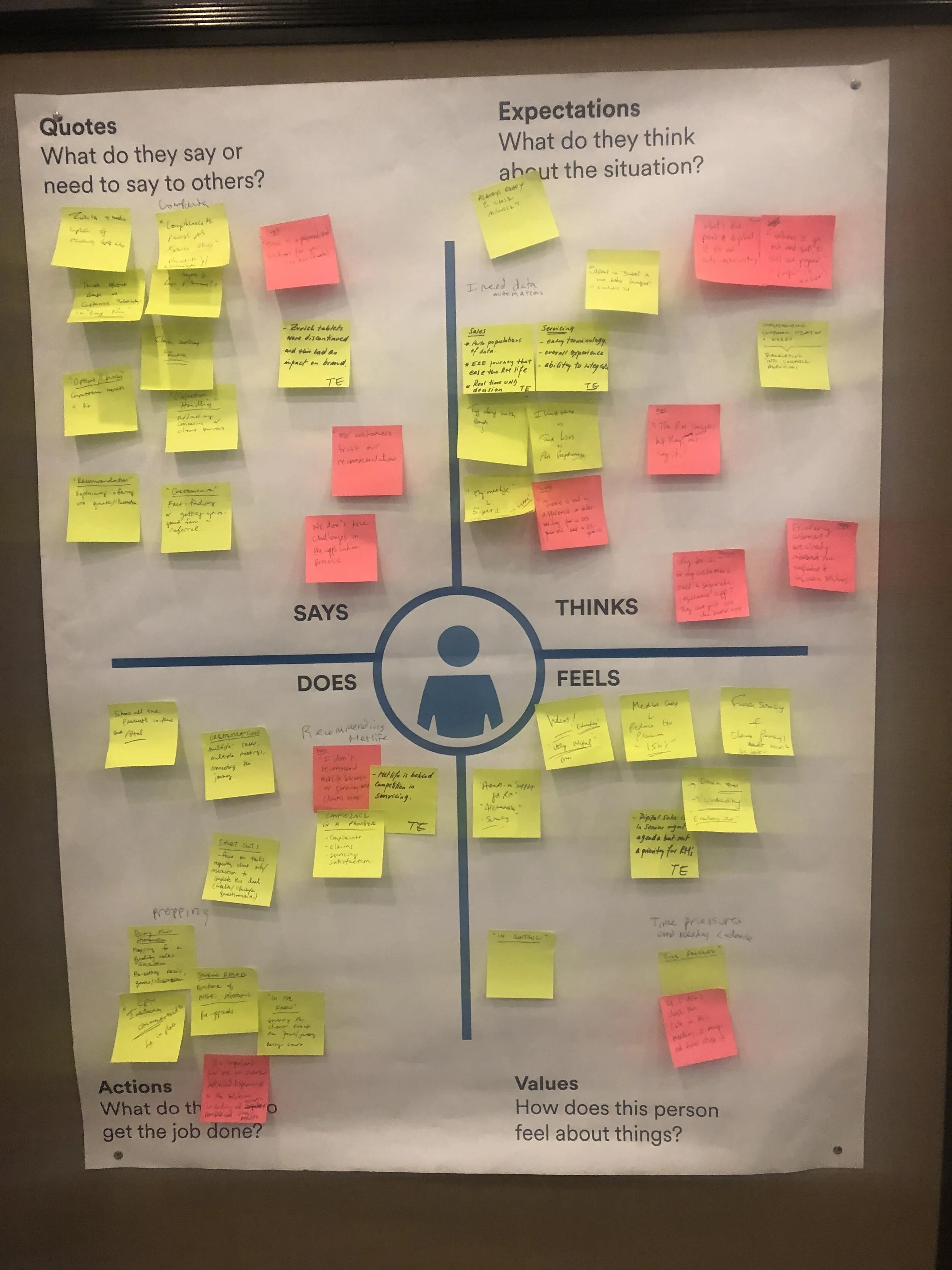
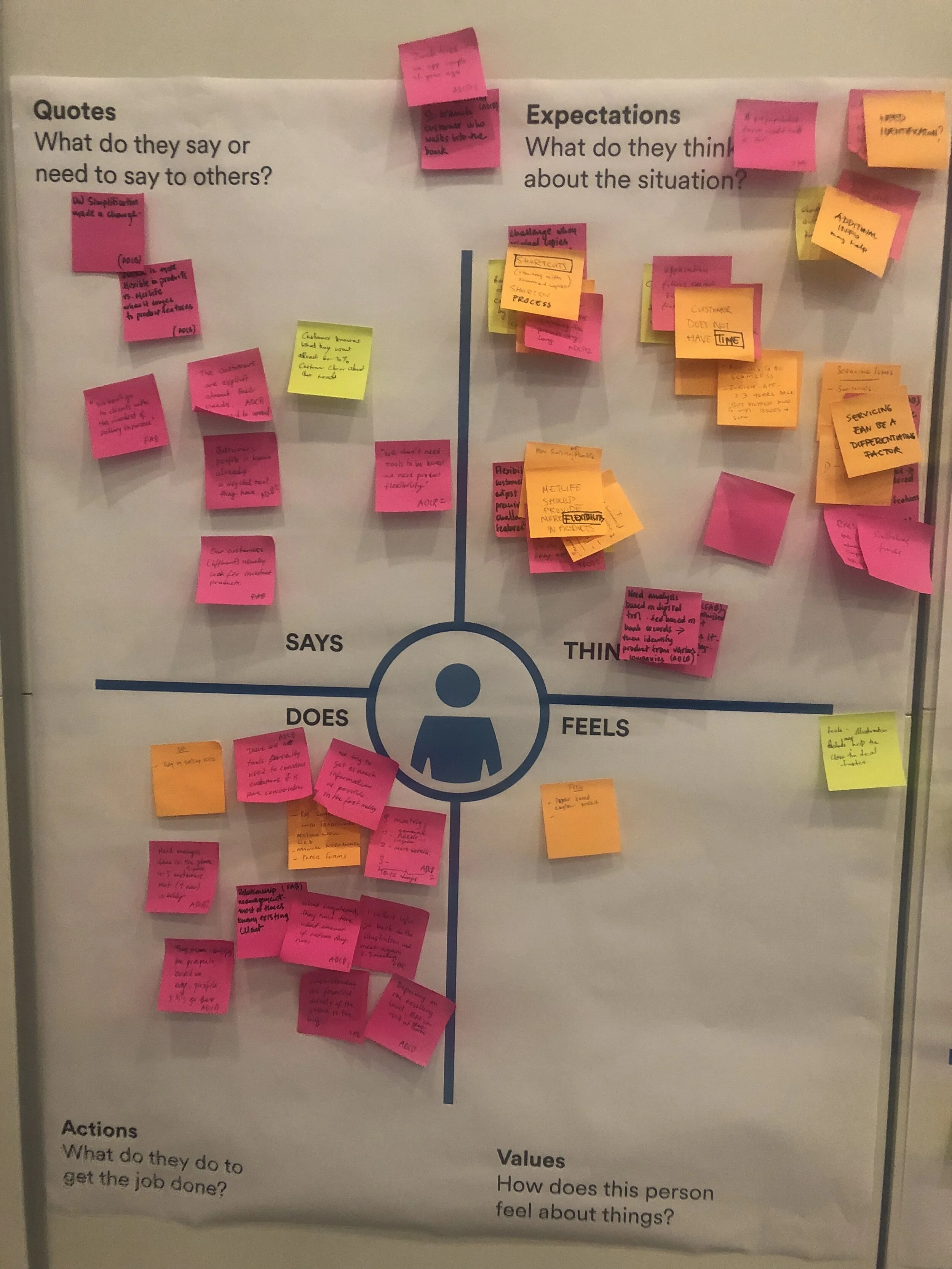
Empathy Mapping
During this activity participants shared thoughts about what they knew about the invented persona, their needs, goals, expectations, behaviors, and pain points.
4 essential points to be mapped out during this session were Quotes (What do they say or need to say to others?), Expectations (What do they think about the situation?), Actions (What do they do to get the job done?) and Values (how does this person feel about things?).
Pain points ranged from time to complete a task and the improvement of personalization. These were regarded as the highest points to consider in the new app experience.
As-Is Mapping
During the As-Is mapping activity, participants combined what they knew about a user’s behavior/mentality with their own experience using the pre-existing sales app through a series of steps and themes.
By finding additional pain points, we found new areas of opportunity.
User Scenarios
RMs, designers, and business delegates were a part of a user scenario or “needs statements” session to pinpoint solutions and goal findings to solve these mock scenarios.
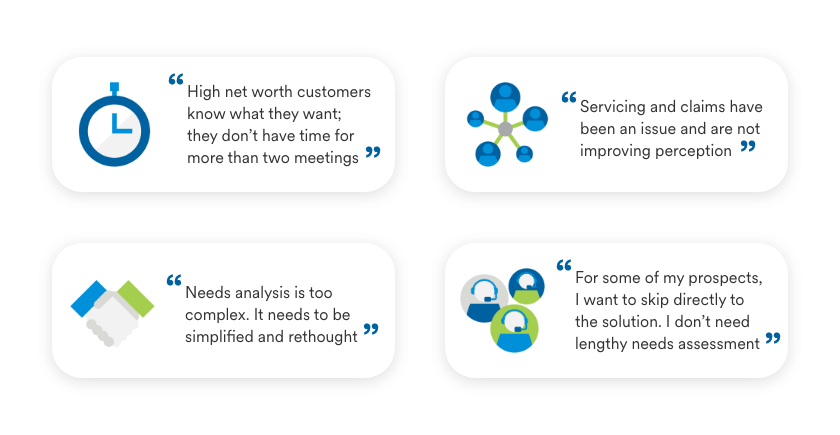
User Interviews
During user interviews, we had the opportunity to speak to various stakeholders and agents who reflected on their own experience with the current sales app.
Interviews were comprised of 15 RMs, 4 bank specific delegates and 3 regional managers to understand their day-to-day tasks.
03. Ideation
After a substantial amount of research in the discovery phase, we began to rapidly ideate with wireframes to present high-level actionable items that were top of mind to our users.
Wireframes were created to form variations that could potentially work in the final design. These wireframes depict early versions of our dashboard experience within the sales app.
Visual Design System
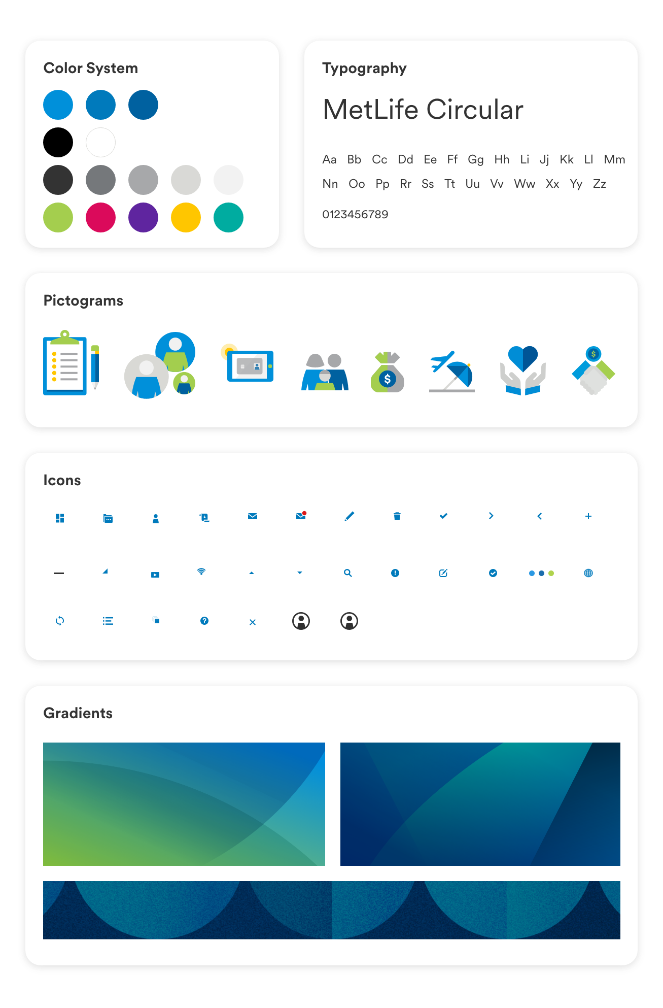
In conjunction with the brand team, we utilized the new MetLife visual system and applied it to the new sales app experience.
04. Prototyping
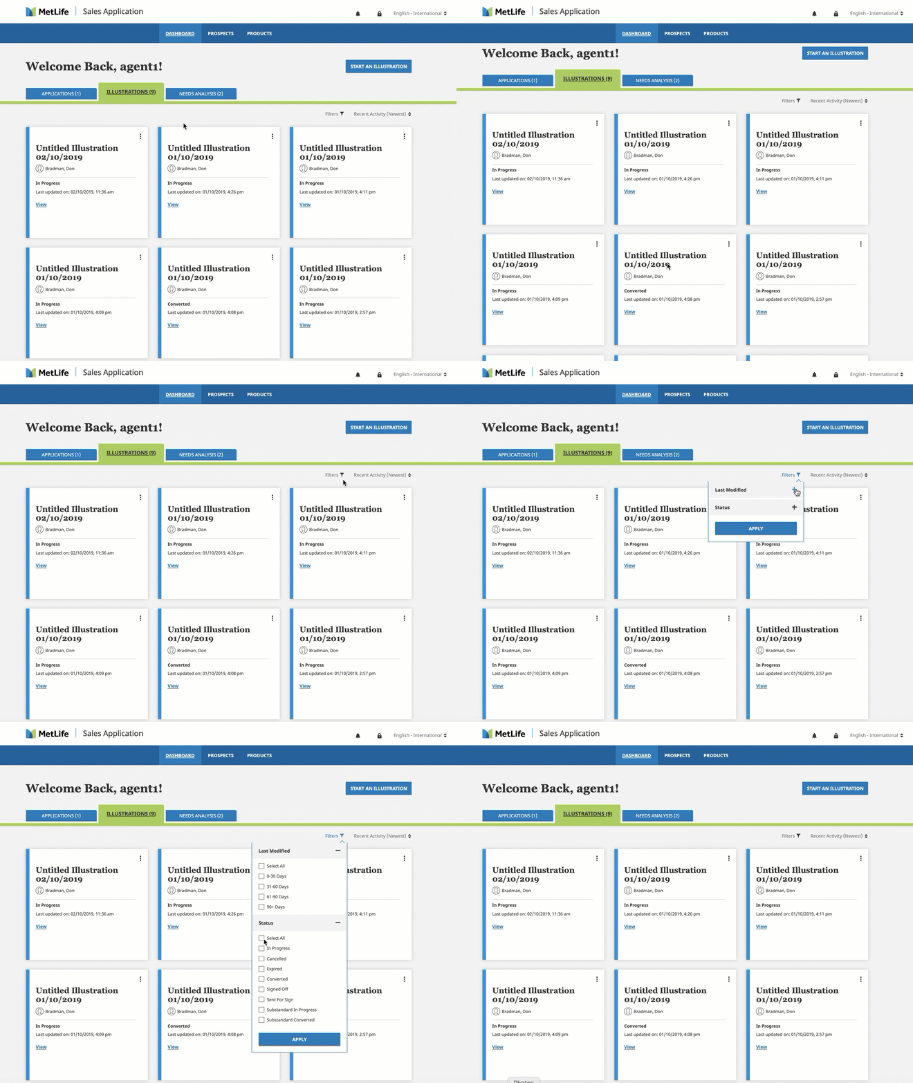
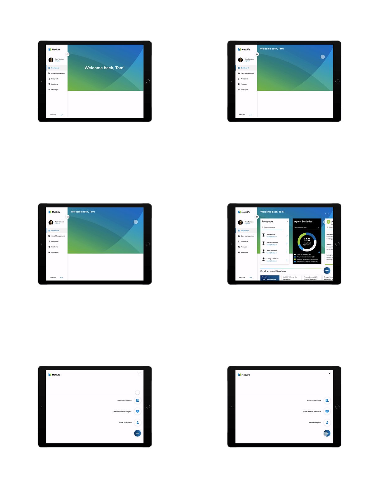
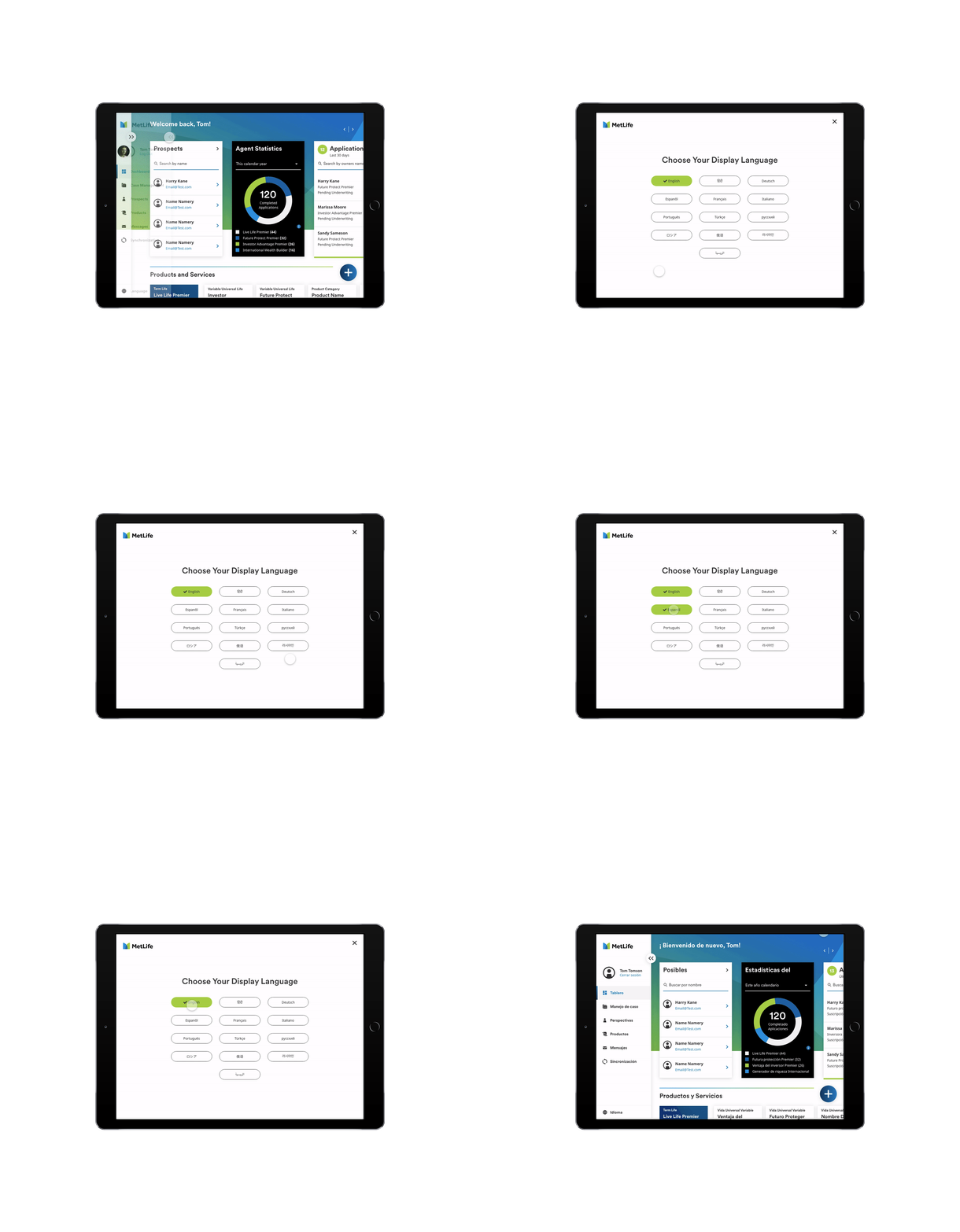
Multiple hybrid prototypes were designed in quick succession to illustrate complex flows and interactions.
These Prototypes are preliminary variations of one aspect of the sales agent app. This particular prototype above is part of the dashboard where the RM or sales agent can conduct their daily task with quick paths to navigate them to important actions. To view the full experience, please click this link.
05. Testing
Once the primary and complex sections of the app were created, we conducted a user testing session to collect data and insights to how users are finding the new experience and to see if there are any more gaps in the design execution.
Testing Environment
The sessions are recorded with a camera for further analysis.
A grading scale was designed to determine the success/fail rate of tasks that the users would test in these sessions.
Testing Feedback
Overall, results proved that generally the design concept was a strong success.
Participants were made positive remarks about the functionality and usability of the concepts.
They provided insights into additional features that would be beneficial to them down the road.


